Tangible Assets & Graphic Design
TANGABLE ASSET
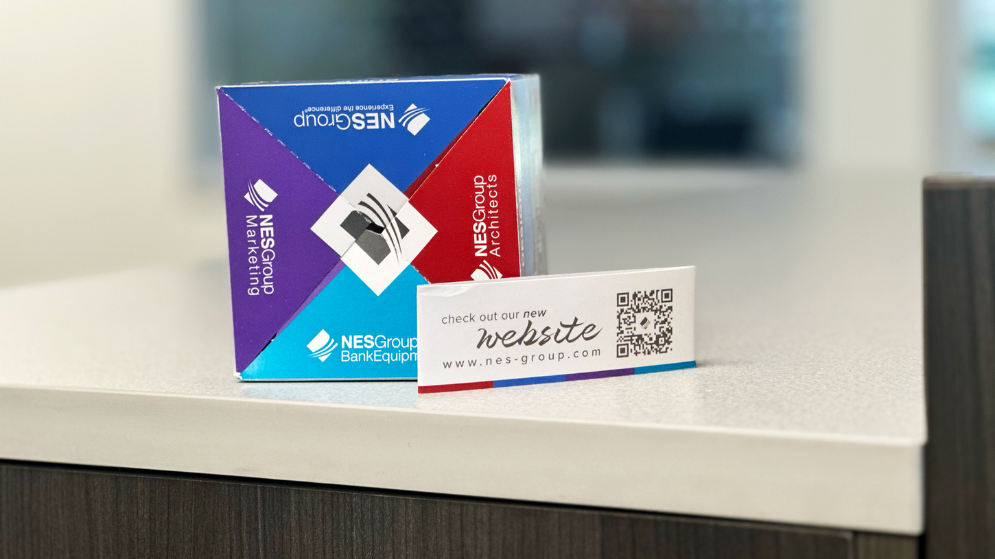
SIX SIDED POP UP CUBE
At this point in NES Groups company they were merging all of their subsidieries under one roof and one brand. We wanted to create a unique and innovative way to showcase this exciting change and that’s why we came up with the 6-sided cube mailer course. This mailer represents the merging of all four branches of our company in an easy-to-navigate, visually exciting way. We are confident that this mailer will be a hit with our customers and will generate lots of excitement around our new unified brand.
TANGABLE ASSET
THE FUTURE OF BANKING IS
"PHYGITAL" MAILER
Our Phygital Mailer is the perfect example of how we merge the best of traditional banking with the latest in digital advancements. By embracing the phygital world, we deliver our customers an experience they never knew they wanted. Our mailer features a QR code that bridges the gap between physical and digital realms, allowing viewers to seamlessly continue their banking journey on their mobile device.
NES GROUP
50TH ANNIVERSARY
The NES Group is celebrating its 50th anniversary, marking half a century of innovation, growth, and excellence. This milestone commemorates the company's journey and achievements, reflecting on its rich history and setting a visionary course for the future.
To celebrate and honor the company's golden anniversary, we refreshed their logo, social media branding on LinkedIn, email signatures, brand stamps, and overall aesthetic. A golden accent was incorporated into all elements, adding a touch of elegance and highlighting this milestone throughout the year.
-08.png)
-02.png)
GRAPHIC DESIGN
THE EAGLE
I joined the Eagle Newspaper as a freshman and remained on the multimedia team until graduation, designing graphics for the website and Instagram, creating covers for the semester Print Edition, and leading the redesign of the podcast covers to introduce a new visual identity. I also initiated a project to redesign the website, showcasing my branding and design skills. Although the redesign wasn't implemented, the concept emphasized modernizing the newspaper's appearance by replacing the traditional "E" emblem with an eagle, aiming to enhance brand recognition and better engage our audience across digital platforms.
GRAPHICS TO ACCOMPANY ARTICLES
PRINT EDITION COVERS


PODCAST COVERS
TANGABLE ASSET
ZBT MERCHANDISE
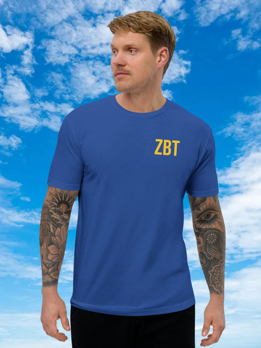
As a part of the Zeta Beta Tau Communications Team I was tasked with designing merchandise to accompany and evoke different themes portrayed by specific fraternity rush themes. In the fall of 2021 the organization went 'back to the future' with a rush and rush graphics that evoked the themes as visual style of the film. In the fall of 2022 the organization embraced the global nature of its members with the theme 'ZBT Gone Global' merchandise featured the rush cycles accompanying logo. In the spring of 2023 the organization took to the skies with a nasa themed rush event and graphics featuring a custom logo put on white hoodies to evoke the theme of space travel and a space suit. In the Spring of 2024 the organization put the pedal to the medal with a Formula One Racing theme which saw tee shirts featuring the rush campaigns accompanying logo and ZBT on the front in an accompanying font.


